2020 Presidential Election Maps
Introduction
For my Data Science (STAT2600) project, I developed a series of visuals for the 2020 Presidential Election, featuring the contest between Trump and Biden. My goal was to create impartial visuals to gain a clearer understanding of 2020’s election outcomes. Utilizing datasets with election details such as, county, state, and county-level votes across the U.S., I merged and cleaned the data for a more precise analysis. By focusing on states with notable patterns, I was able to identify and analyze trends. Although the project primarily concentrates on the election maps, it also provides a broader perspective, incorporating an analysis of the overall results and relevant current events.
Maps
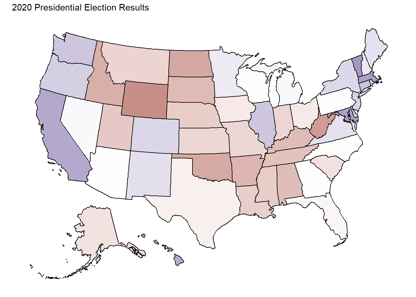
Map of 2020 Presidential Election
Map Details
The white coloration shows the vote was approximately 50 50.
The blue coloration signifies a majority vote for Joe Biden.
The red coloration indicates a majority vote for Donald Trump.
Map of 2020 Presidential Election by County
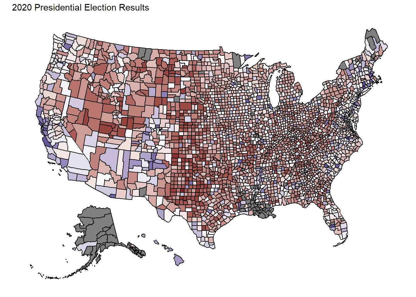
This map illustrates the voting patterns of each county in the United States. At first glance, the extensive coverage of red areas is striking, especially considering Joe Biden’s victory in the election. While an intuitive prediction might have suggested such a pattern, the actual extent of it may surpass expectations.
Colorado County Votes
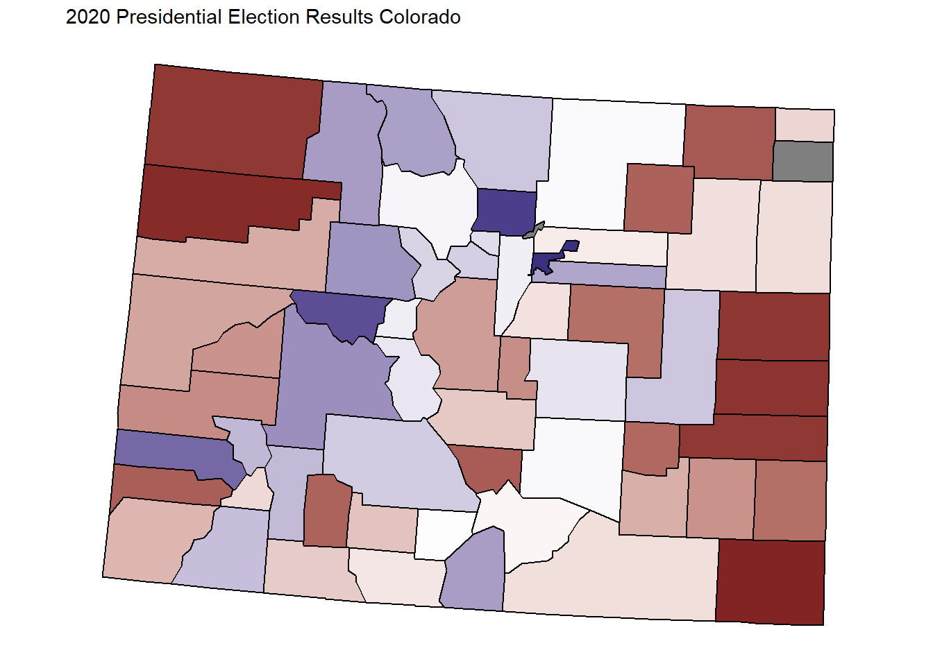
There is a lot of blue and red which demonstrates that Colorado is more of a swing state. 55.4% of the vote went to Joe Biden, so Colorado was a blue state for this race.
Displayed here is a map depicting the voting outcomes of every county in Colorado. The presence of both blue and red hues indicates that Colorado tends to sway between political affiliations. In this election, Joe Biden secured 55.4% of the vote, solidifying Colorado’s status as a blue state for this particular race.
California County Votes
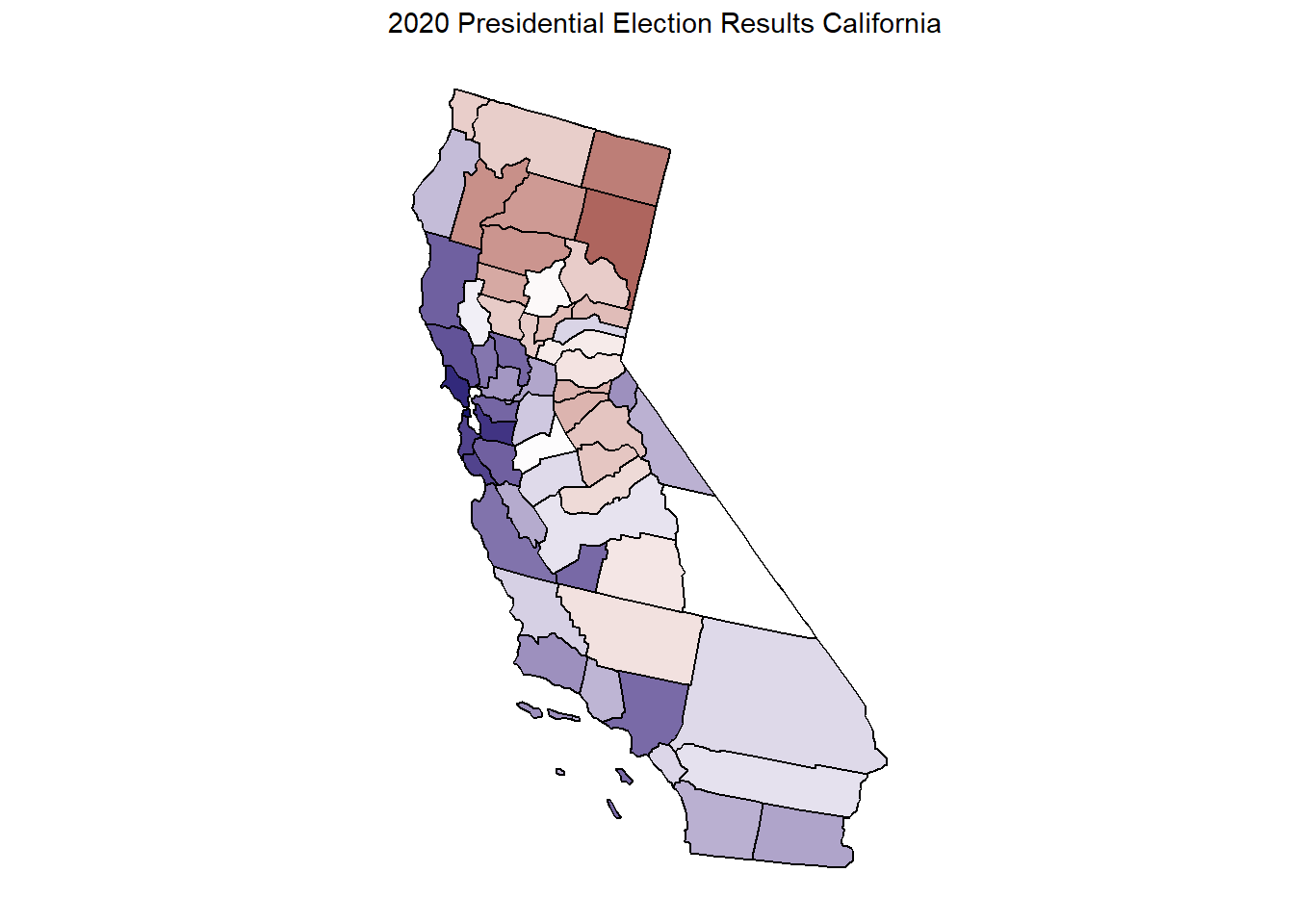
This map illustrates the voting patterns across every county in California. Given California’s status as a predominantly blue state, it came as no surprise that the majority of counties cast their votes for Joe Biden in this election. With 63.5% of the vote going to Biden, the state reaffirmed its Democratic leaning.
Wyoming County Votes
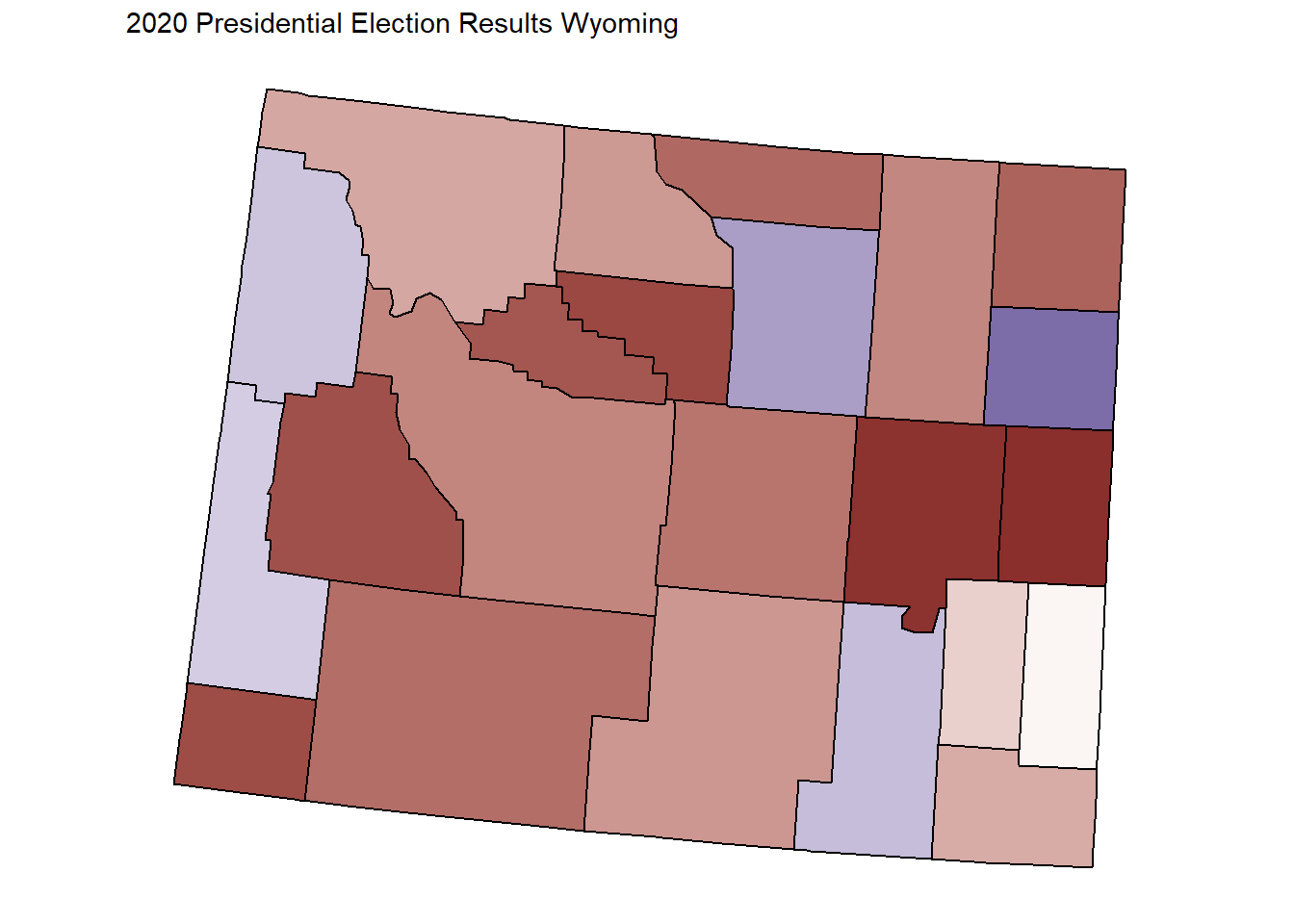
The map illustrates the voting distribution across Wyoming’s counties. Reflecting Wyoming’s usual political leaning, the vast majority of counties favored Donald Trump. He received 69.9% of the total vote within Wyoming
Top 6 Candidates in the 2020 Presidential Election
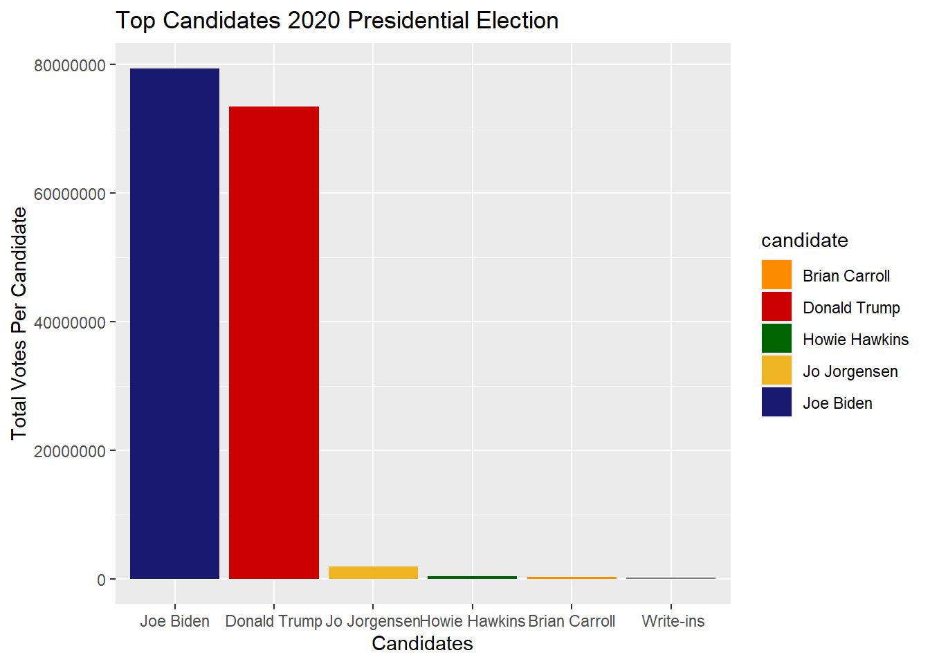
This graph presents the top six candidates in descending order, starting with Joe Biden, who received the most votes, down to the write-in candidates, who received the least. Each candidate is represented by a color corresponding to their party’s traditional color scheme.undefined
# A tibble: 6 × 2
  candidate       total_votes_by_candidate
  <chr>                              <int>
1 "Joe Biden"                     79409294
2 "Donald Trump"                  73472591
3 "Jo Jorgensen"                   1837566
4 "Howie Hawkins"                   386737
5 "Brian Carroll"                   219899
6 " Write-ins"                      154724
This table shows the exact number of votes each candidate got in the race.
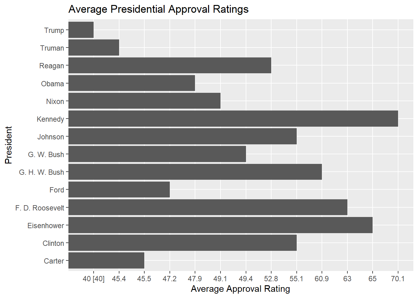
This visual displays the approval ratings of the last 14 presidents. Trump’s average approval rating stands at 43%. Although this isn’t as relevant to the rest of the data, I thought it was interesting to provide a broader historical context.
Contrasting Opinions on Election Data/ Ablation
To make sure that all of my results were accurate, I compared them to professional plots made for the election results and they were practically identical.
A common argument for this topic is widespread voter fraud where the count of all the ballots would be incorrect. The FBI investigations are still searching for any fraud that did occur in this election.
Literature Review
According to The Associated Press the actual vote count for Biden was 81,283,009 and the vote count for Donald Trump was 74,223,287. The difference between Biden’s vote count and mine was that mine was short 1,873,715 votes, and the difference between Trump’s vote count and mine was short 750,696 more than the actual vote count.
Conclusion
Joe Biden won the 2020 election, with Donald Trump finishing closely behind. Given the narrow margin of victory in this year’s election and considering Donald Trump’s historically low approval ratings, it will be intriguing to observe how Joe Biden’s approval ratings compare with past candidates.
Appendix for Inital Data Cleaning
Code Used in Election Map
president_county_candidate = read.csv("president_county_candidate.csv")

democrat <- president_county_candidate%>%

  group_by(candidate, state) %>%

  summarize(total_votes_by_candidate = sum(total_votes))%>%

  filter(candidate =="Joe Biden"|candidate == "Donald Trump")%>%

  group_by(state)%>%

  summarize(ratio = total_votes_by_candidate/ sum(total_votes_by_candidate), candidate=candidate)%>%

  filter(candidate == "Joe Biden")
`summarise()` has grouped output by 'candidate'. You can override using the
`.groups` argument.Warning: Returning more (or less) than 1 row per `summarise()` group was deprecated in
dplyr 1.1.0.
ℹ Please use `reframe()` instead.
ℹ When switching from `summarise()` to `reframe()`, remember that `reframe()`
always returns an ungrouped data frame and adjust accordingly.`summarise()` has grouped output by 'state'. You can override using the
`.groups` argument.Explanation of Cleaning Code:
In order to create a map of the election data I needed to start by organizing the data where I would get a table that I can work with for ggplot. I started by grouping the candidate and state together and using summarize to add the total number of votes for the candidates by state. Since I only wanted republican vs democrat I put a filter on the candidates to make it where the only votes shown are Joe Biden’s and Donald Trump’s. To calculate the percentage of people that voted republican vs democrat I took the newly calculate total_votes_by_candidate for one candidate and divide it by the total number of votes for the two candidates. I had to add candidate=candidate to add a candidate column to the spreadsheet. Since it doesn’t matter whether or not you graph based on republican or democratic since the percentages will be accurate either way, then I just chose to graph based on the percentage of people that voted for Biden.
Cleaning Presidential Election by County Code
county_fips_code = read.csv("Book1.csv")

democrat_county <- president_county_candidate%>%

  group_by(candidate, county) %>%

  summarize(total_votes_by_candidate = sum(total_votes))%>%

  filter(candidate =="Joe Biden"|candidate == "Donald Trump")%>%

  group_by( county)%>%

  summarize(ratio = total_votes_by_candidate/ sum(total_votes_by_candidate), candidate=candidate)%>%

  filter(candidate == "Joe Biden")%>%

  mutate(county = str_remove(county," County"))%>%

  left_join(county_fips_code, by="county")%>%

 # rename(fips = ï..fips )%>%

  ungroup()%>%

  dplyr::select(fips, ratio, candidate)%>%

  mutate(fips = as.character(fips))%>%

  filter(!is.na(fips))
`summarise()` has grouped output by 'candidate'. You can override using the
`.groups` argument.Warning: Returning more (or less) than 1 row per `summarise()` group was deprecated in
dplyr 1.1.0.
ℹ Please use `reframe()` instead.
ℹ When switching from `summarise()` to `reframe()`, remember that `reframe()`
always returns an ungrouped data frame and adjust accordingly.`summarise()` has grouped output by 'county'. You can override using the
`.groups` argument.Warning in left_join(., county_fips_code, by = "county"): Detected an unexpected many-to-many relationship between `x` and `y`.
ℹ Row 10 of `x` matches multiple rows in `y`.
ℹ Row 243 of `y` matches multiple rows in `x`.
ℹ If a many-to-many relationship is expected, set `relationship =
"many-to-many"` to silence this warning.Explanation of Code Above:
Started with same code for state map but replaced state with county
Had to download a separate file that had the county fips code because plot_usmap doesn’t contain those values
Took county fips code data set and made changes to it where it would be able to join the democrat county data set. This involved changing the county names so they matched, and selecting the columns needed to have the fips match the county.